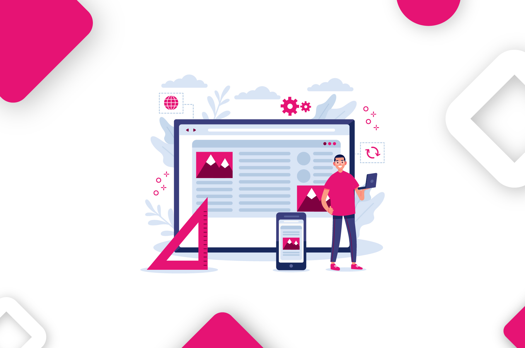
In the digital age, businesses constantly seek ways to reach customers more effectively and provide a seamless user experience. Whether through a website or a mobile app, the goal is to keep the audience engaged and offer them the best possible interface to interact with your brand.
But here is the million-dollar question: Should you invest in a responsive web design or develop a dedicated mobile app for your business?
This blog post will help you navigate through the complex digital landscape and make an informed decision. Both responsive websites and mobile apps offer unique advantages and cater to specific user behaviors. But which one aligns with your business objectives? Which provides the most value regarding cost, reach, functionality, and user experience?
What is Responsive Web Design?
Imagine walking into a store. It is spacious well-lit, and the products are neatly arranged. You can easily find what you are looking for. That is what a responsive website feels like. It is a site designed to look good and work well on any device, whether desktop, tablet, or mobile. It is like a one-size-fits-all outfit that looks great whether you are tall, short, slim, or plus-sized.
An Overview of Mobile Apps
Now, think about your favorite coffee shop. They know your name, your usual order, and how you like your coffee. That is the kind of personalized experience a mobile app offers. It is software designed specifically for mobile devices.
You download it from the App Store or Play Store, and it provides you with services similar to those you would get on a PC. But here is the kicker: it can work offline and use your device’s features to enhance your experience.
How Can Businesses Leverage A Responsive Website To Their Advantage?
In the ever-evolving digital landscape, having a website that caters to many devices is no longer an option but a necessity. This brings us to the concept of responsive web design – a design approach that allows your website to adapt and deliver an optimal experience on any screen size.
Reason Why Responsive Websites Are Indispensable?
You are hosting a party, and you have guests of all ages coming over. Now, you would not serve the same food to everyone. You would have finger foods for the little ones, healthy options for the health-conscious, and various dishes to cater to different tastes. That is precisely what a responsive website does for your business – it caters to everyone.
Here is why businesses should consider using a responsive website:
- One Size Fits All
Like an outfit that looks great on everyone, a responsive website ensures that your site looks good and works well on any device – desktop, tablet, or mobile.
- Reach A Greater Audience
With more people using mobile devices to access the internet, a responsive website allows you to reach a wider audience.
- Enhanced User Experience
A responsive website provides a seamless user experience across different devices, increasing customer satisfaction and loyalty.
- Improved SEO
Search engines love responsive websites! Having one can improve your search engine rankings, making it easier for potential customers to find you.
- Cost-Effective
Maintaining separate sites for desktop and mobile can be costly and time-consuming. With a responsive design, you only need to carry one site.
- Better Analytics
With a responsive site, businesses can track, report, and analyze website data from one place, making it easier to understand user behavior and make data-driven decisions.
- Lower Bounce Rate
A responsive website encourages users to stay longer, thereby reducing the bounce rate.
- Future-Proof
Technology is constantly evolving, and new devices with different screen sizes are continually being developed. A responsive website ensures your site will work well on any future device.
So, just like serving the right food at your party makes your guests happy, having a responsive website can help satisfy your customers’ digital appetites!
Does A Responsive Website Work Well On Mobile?
Yes, a responsive website does work well on mobile. The primary goal of responsive design is to ensure that a website maintains its usability and readability across various devices, including mobile phones.
Responsive design uses flexible layouts, flexible images, and CSS media queries to adapt the website to the device’s screen size. So whether a user views your site on a desktop computer or a mobile phone, they will have an optimized viewing experience.
Moreover, with the increasing use of mobile devices to access the internet, having a responsive website has become more critical than ever. It not only improves user experience but also has positive implications for SEO. Google, for instance, places a high importance on mobile-friendly websites and has included mobile-friendliness as a ranking factor in its algorithms.
Therefore, if you want your website to reach a wider audience and provide an optimal user experience regardless of the device, a responsive design is the way to go.
Key Features Of A Responsive Website?
A responsive website stands as a beacon of adaptability and user-centric design – seamlessly shifting and reshaping itself to fit the unique characteristics of each user’s device.
What sets a responsive website apart are its key features, a harmonious blend of design and technology that ensures your online presence is not only accessible but also engaging!
- Fluid and Flexible Layouts
At the core of responsiveness lies the ability to adapt. Responsive websites employ fluid grid systems that automatically adjust content and elements to fit the screen’s size and orientation. The scalability enables your site to look stunning and is easy to navigate, regardless of the device.
- Media Queries
Media queries are your website’s guardian angels. They detect the screen dimensions and characteristics and trigger specific styles and layouts accordingly. It is like having a tailor adjust your outfit to your exact measurements.
- Images that Scale
Responsiveness does not stop at text and layouts. Images also play a crucial role. Responsive websites use scalable images that maintain quality while adjusting their size to load faster and fit different screens.
- Touch-Friendly Navigation
For mobile and tablet users, touch is the primary mode of interaction. Responsive websites incorporate touch-friendly navigation elements, such as larger buttons and intuitive swipe gestures, ensuring a seamless experience.
- Optimized Performance
Responsiveness is not just about looks; it is about speed, too. Responsive websites prioritize performance, optimizing code and content to reduce loading times. Quick-loading pages keep users engaged and improve SEO rankings.
- Content Prioritization
On smaller screens, there is limited real estate. Responsive websites intelligently prioritize content, ensuring the most crucial information remains front and center. Users do not have to pinch and zoom to find what they need.
- Consistent Branding
Your branding should be consistent across all devices. Responsive websites maintain your brand identity, ensuring your logo, colors, and typography are compatible, reinforcing your brand’s professionalism.
- Cross-Browser Compatibility
The web is a vast ecosystem with different browsers and platforms. A responsive design is compatible with various browsers, ensuring a consistent user experience.
Why Should You Develop A Mobile App For Your Business?
Having a mobile app for your business is like having a VIP pass to an exclusive club. It opens up opportunities that can catapult your business to new heights.
One of the key advantages of developing a mobile app is the value addition it brings. Mobile apps allow businesses to offer more than just products or services. They can provide loyalty rewards, personalized content, and more, enhancing the customer experience. A report found that 79% of smartphone users have purchased online using their mobile devices. These stats significantly highlight the growing trend of mobile commerce and the importance of having a mobile app for businesses.
But there is more to it; a mobile app is an extension of your brand. Think of it as a billboard always visible to your customers, helping you build a stronger brand.
Moreover, mobile apps offer a direct channel to customers. Imagine being able to send a message directly to your customers’ phones about sales, promotions, and more. It is like having a hotline for your customers, keeping them engaged and connected.
And let us remember customer loyalty. By offering a seamless user experience and value-added services, mobile apps can help foster customer loyalty. Consumer spending on apps reached $129 billion as of 2022, indicating the substantial revenue potential that mobile apps can bring to businesses.
In today’s competitive business landscape, having a mobile app can give you an edge over your competitors. It is estimated that there were over 250 million apps downloaded daily between 2019-2020, and this number could double by 2024. This shows the increasing demand and usage of mobile apps worldwide.
Mobile App Key Features
Now, let us take a practical and creative dive into the key features of a mobile app. Your mobile app is a versatile tool with features designed to make your customers’ lives easier and more enjoyable. Here are the essential elements that make a mobile app tick:
- Intuitive User Interface (UI)
The user interface is your app’s calling card. It needs to be user-friendly, visually appealing, and intuitive. Think of it as the front door to your digital world, welcoming users with a smile.
- User Authentication and Security
Security is paramount. Apps should offer secure user authentication methods to protect sensitive data.
- Push Notifications
Push notifications are like your app’s friendly reminders. They inform users about updates, promotions, or crucial information, even when the app is closed.
- In-app purchases and Payments
If your app involves transactions, it should seamlessly handle payments and in-app purchases, ensuring a smooth and secure checkout process.
- Offline Functionality
Mobile apps are not confined to the online world. They can offer certain features or content even without an internet connection.
- Social Media Integration
Apps often connect with our social lives. Integration with social media platforms allows users to share their app experiences, fostering community and engagement.
- GPS and Location Services
Location-based apps use GPS and location services to offer personalized content or services based on a user’s location.
- Offline Storage and Synchronization
Apps can store data locally on the device and sync it with the cloud when connected, ensuring a seamless experience across devices.
- Feedback and Support
A user-friendly app offers channels for feedback and support, allowing users to report issues, ask questions, and feel heard.
- Analytics and User Insights
Understanding your users is crucial. Mobile apps often integrate analytics tools to gather data on user behavior, helping you make data-driven decisions.
In a nutshell, these features are the building blocks of a robust and user-friendly mobile app. They are the tools in your app’s utility belt, designed to provide a seamless and engaging experience for your audience.
The Power of a Mobile App
So, does a mobile app give your business a competitive edge? You bet it does! Here is the lowdown:
Imagine having your business right in your customers’ pockets 24/7. That is what a mobile app does; it keeps you on their radar, enhancing brand visibility.
It is not just any app; it is a personalized powerhouse. You see, it gathers intel on your customers’ preferences and behaviors, allowing you to offer tailor-made content and recommendations.
The world’s moving fast, and a mobile app is your ticket to keeping up. In many industries, it is just the thing to do, making you look fresh and relevant. But it is not just about looking good. Your app can work offline. No internet? No problem. It is more than just a tool; it is your competitive advantage.
Choosing Your Digital Path – Mobile App or Responsive Website?
As we wrap up, it is clear that both responsive web design and mobile apps have their unique advantages and not superiority. The choice between the two is a matter of which is better for your specific business needs. It all comes down to your business goals, target audience, budget, and resources.
So whether you choose a responsive website, a mobile app, or both, remember that the ultimate goal is to provide value to your customers and create a positive user experience. Because in the digital world, customer experience is king.